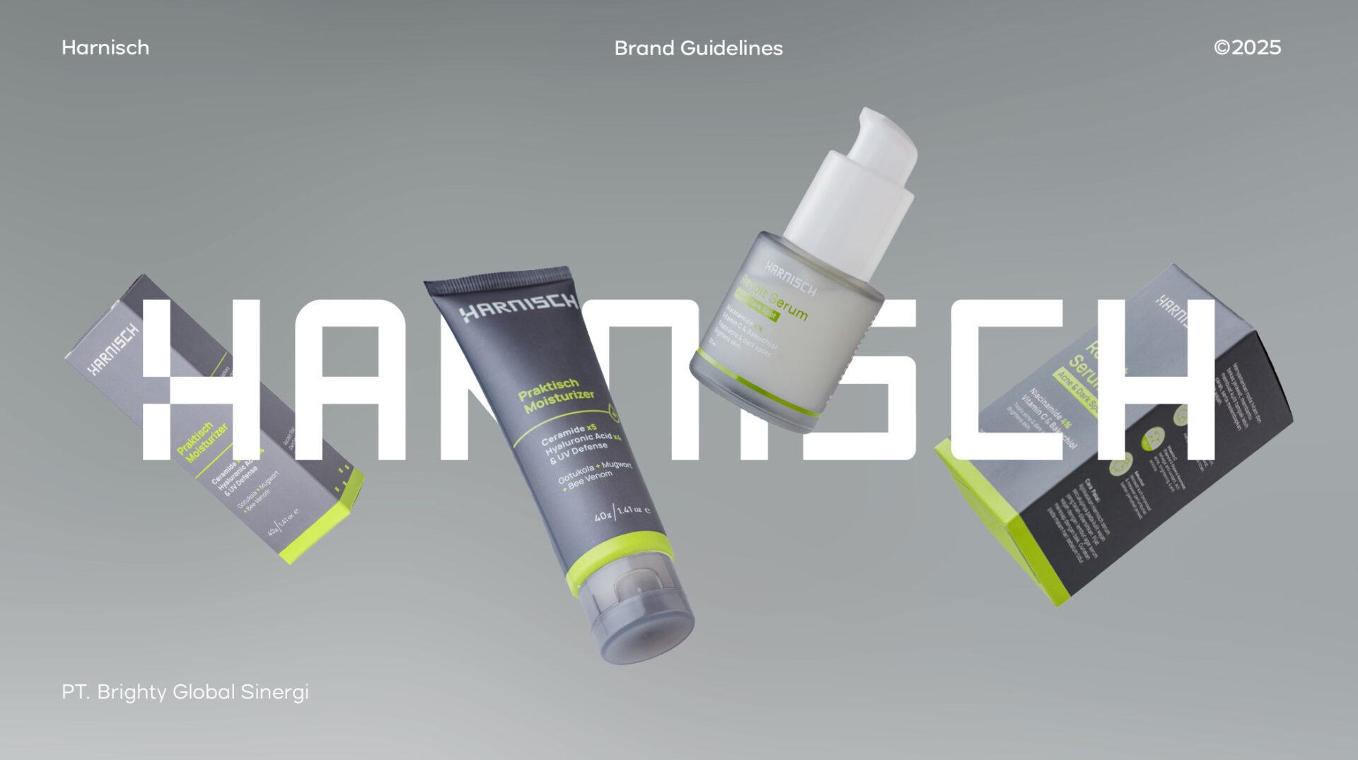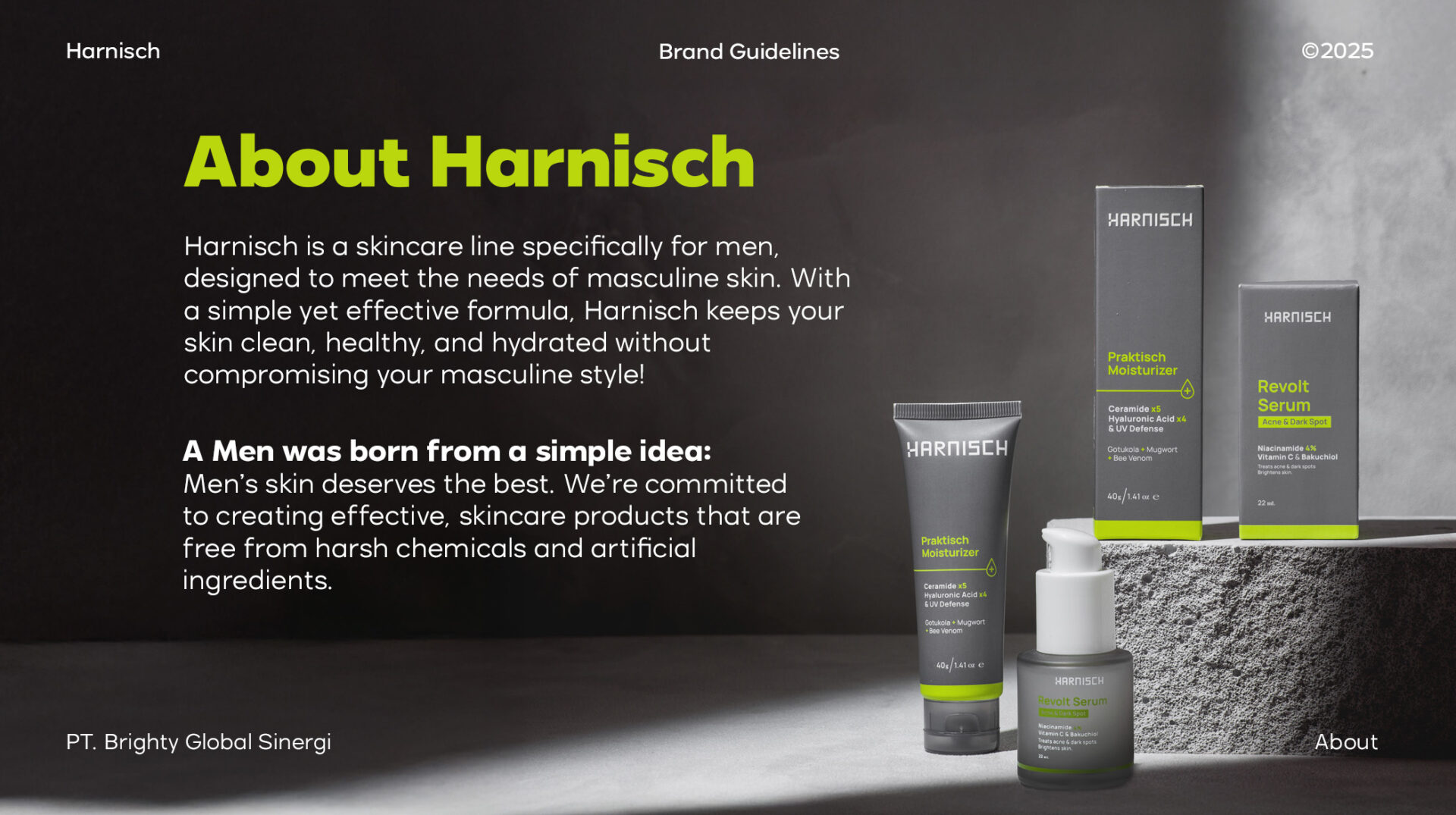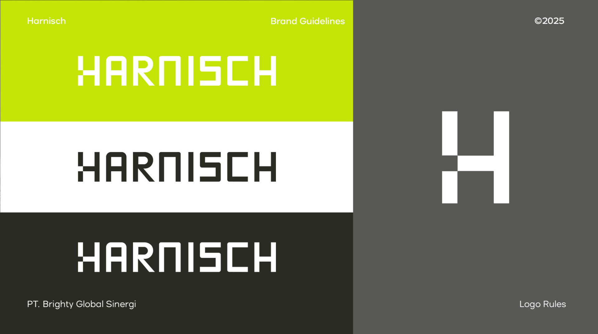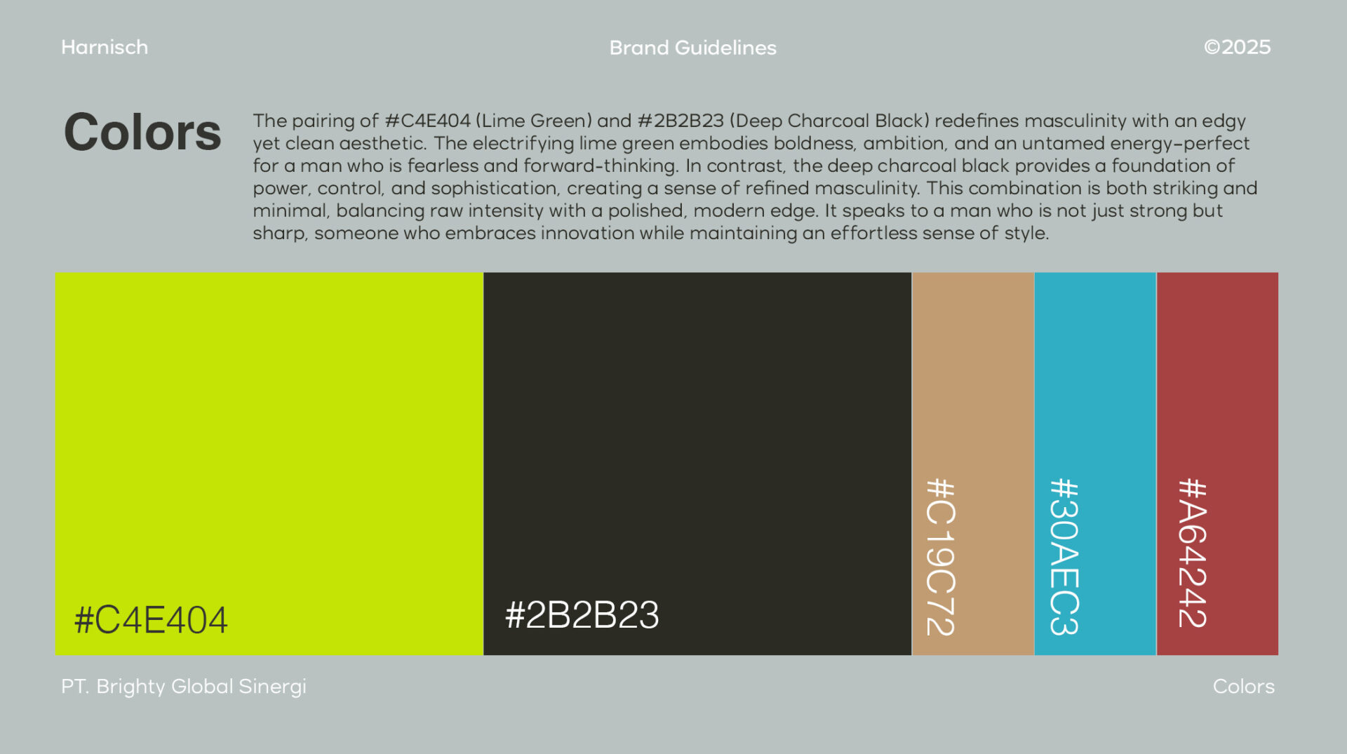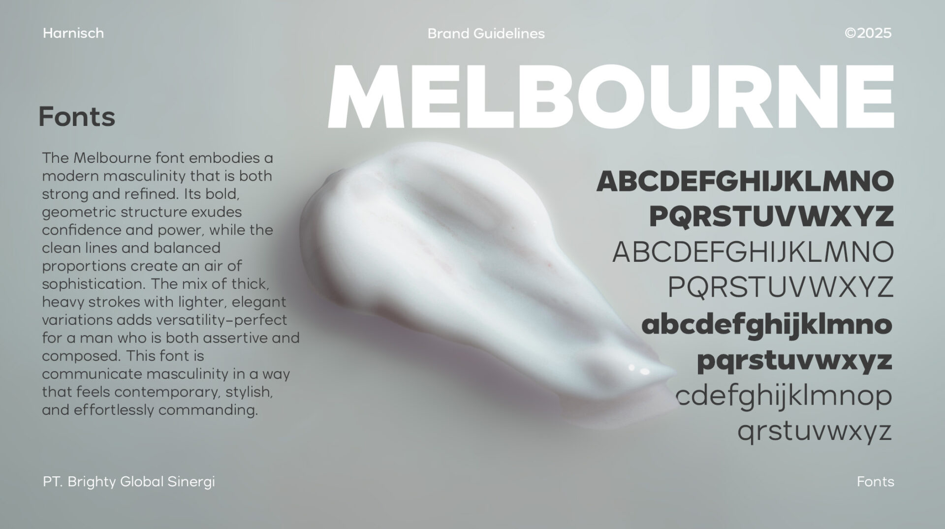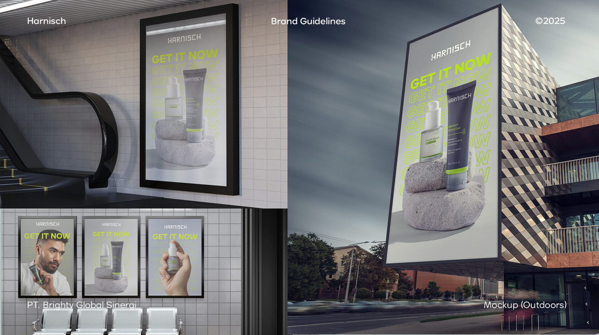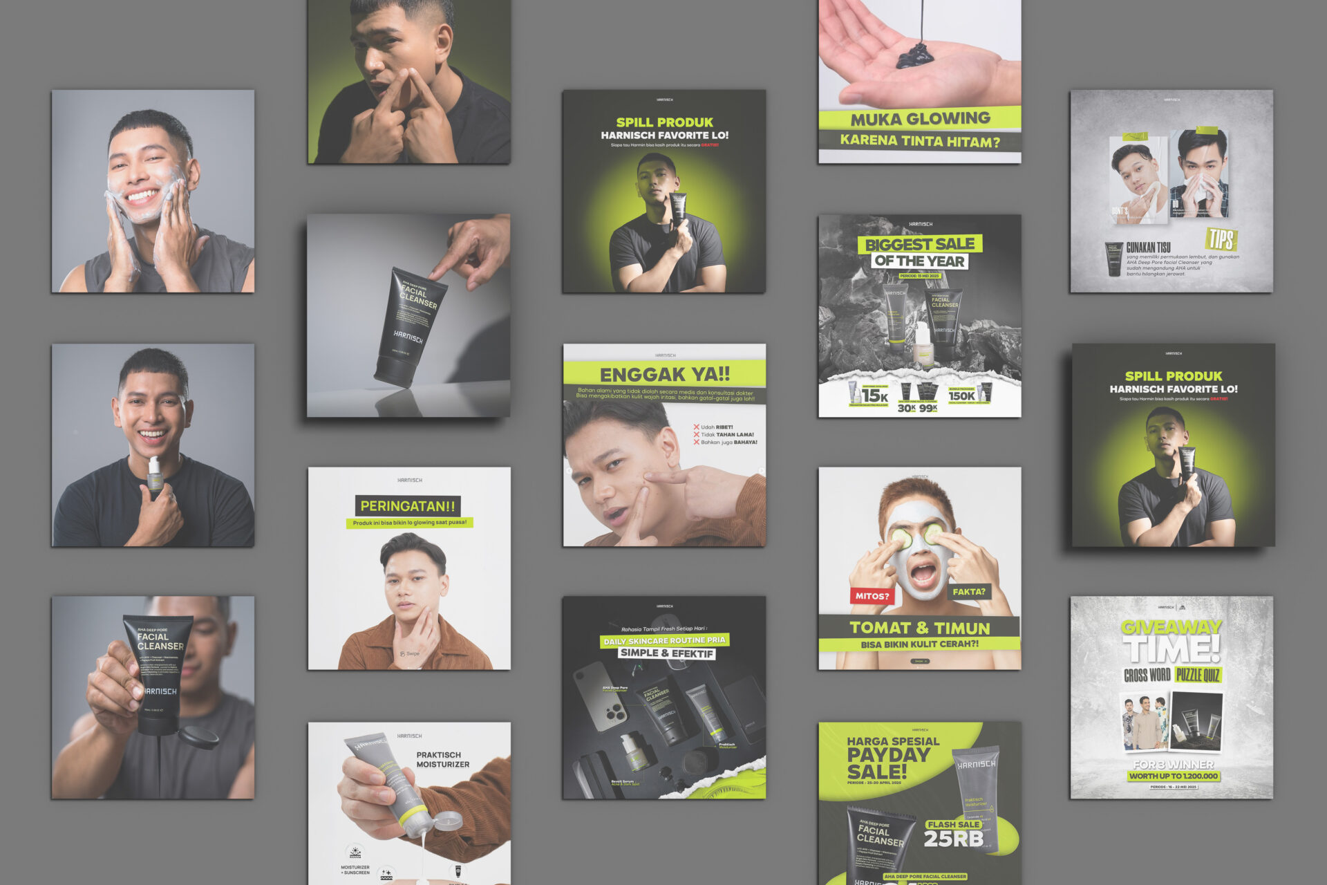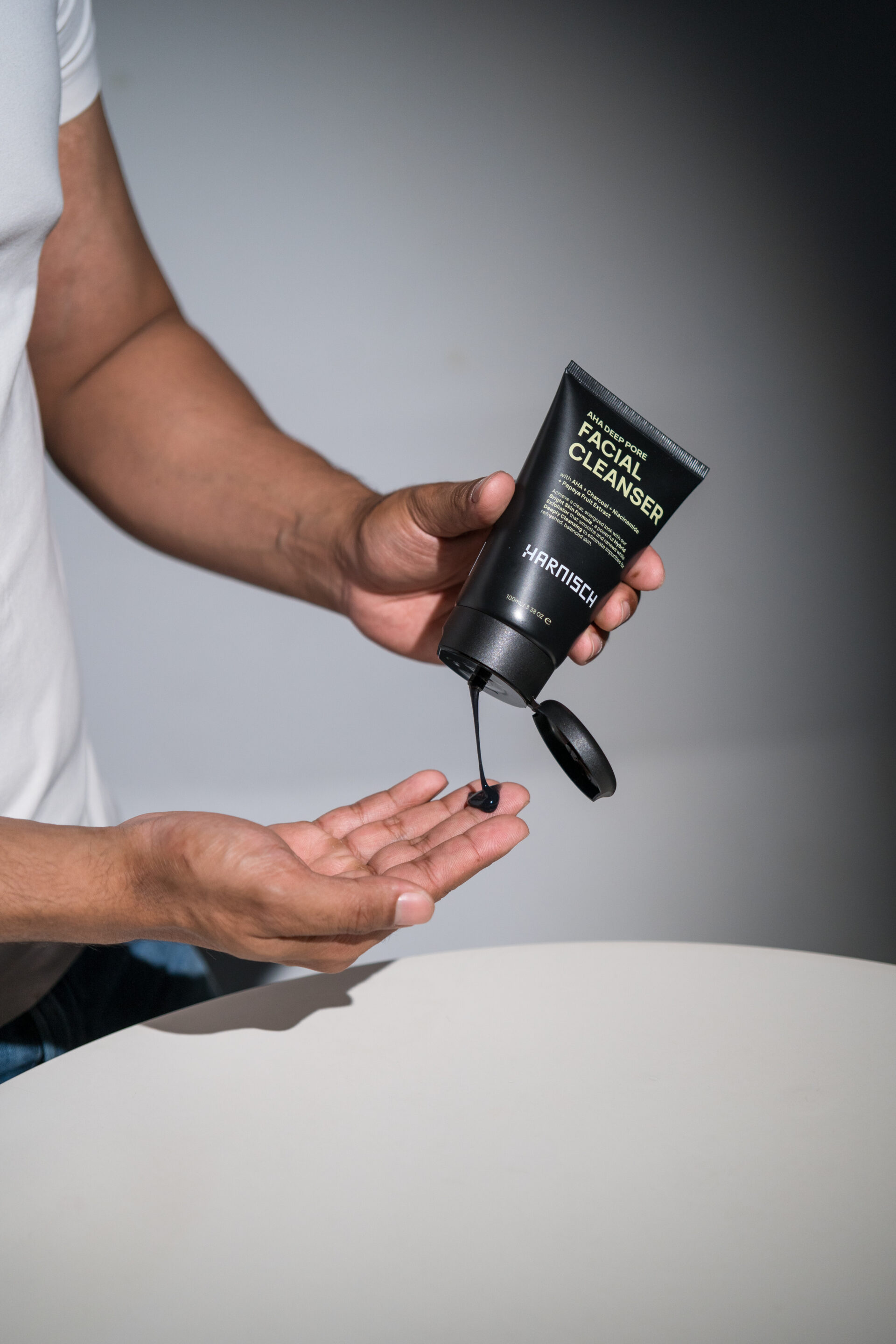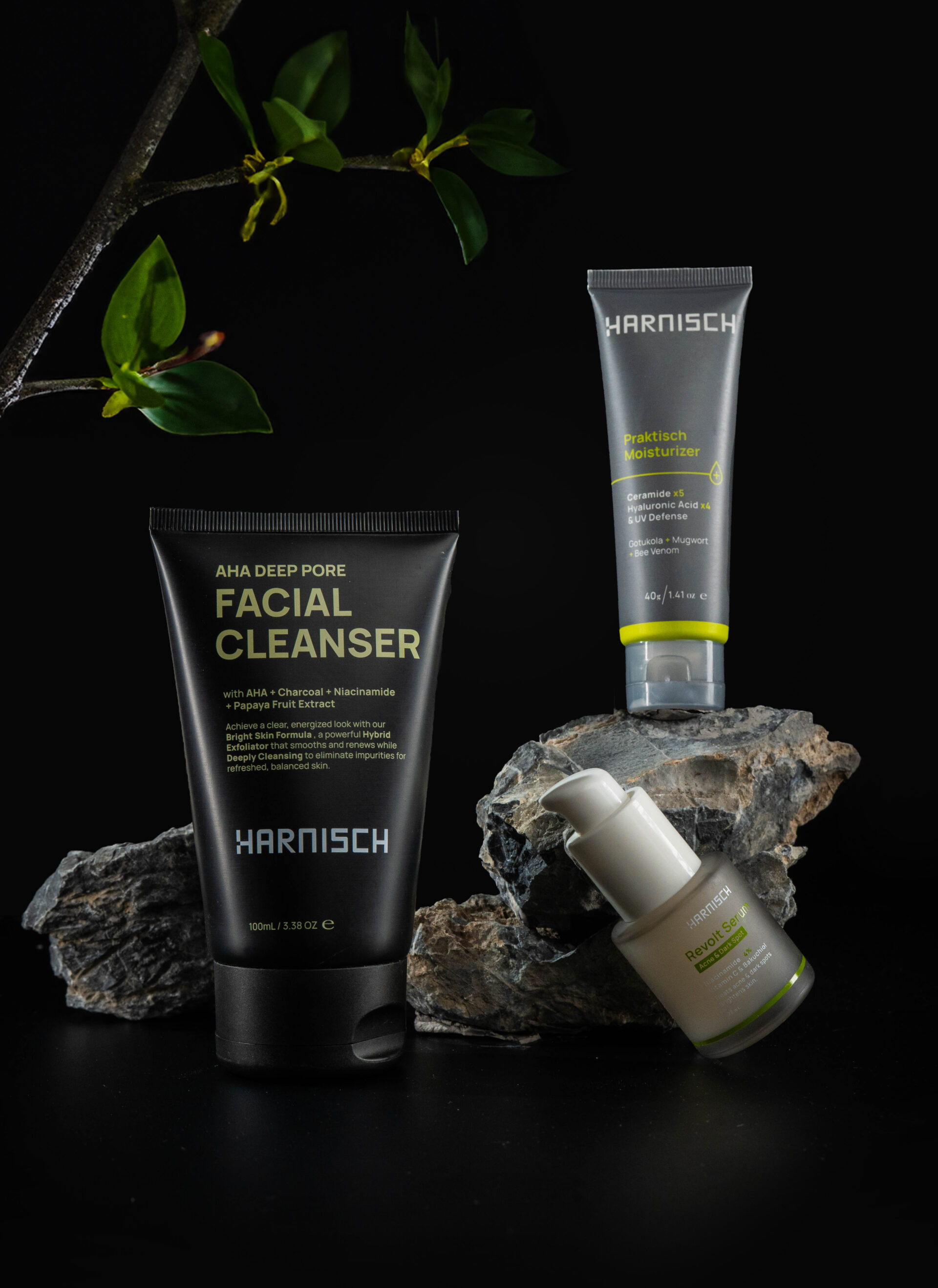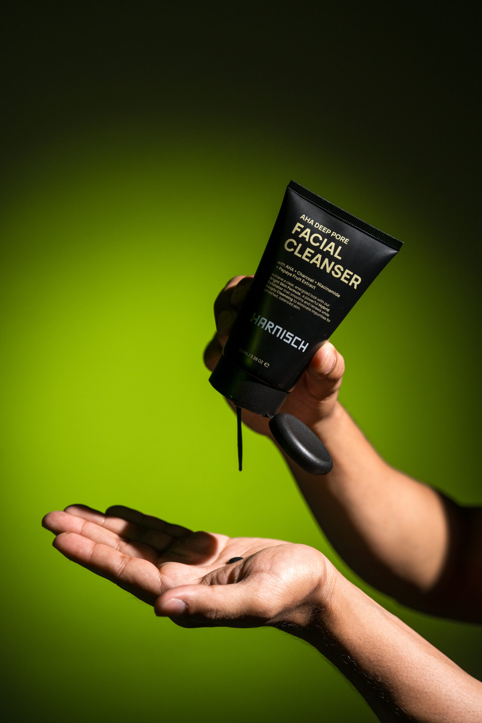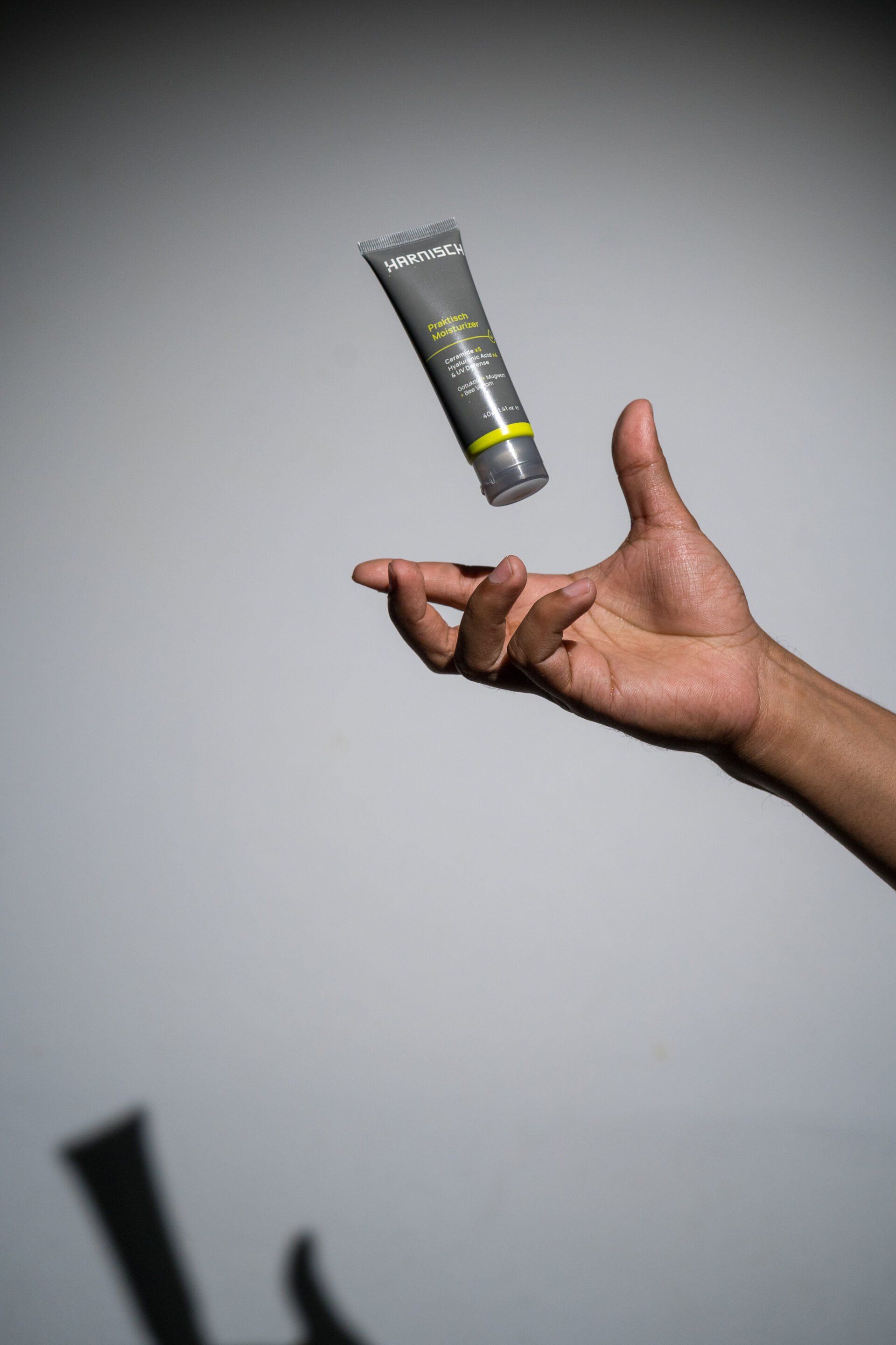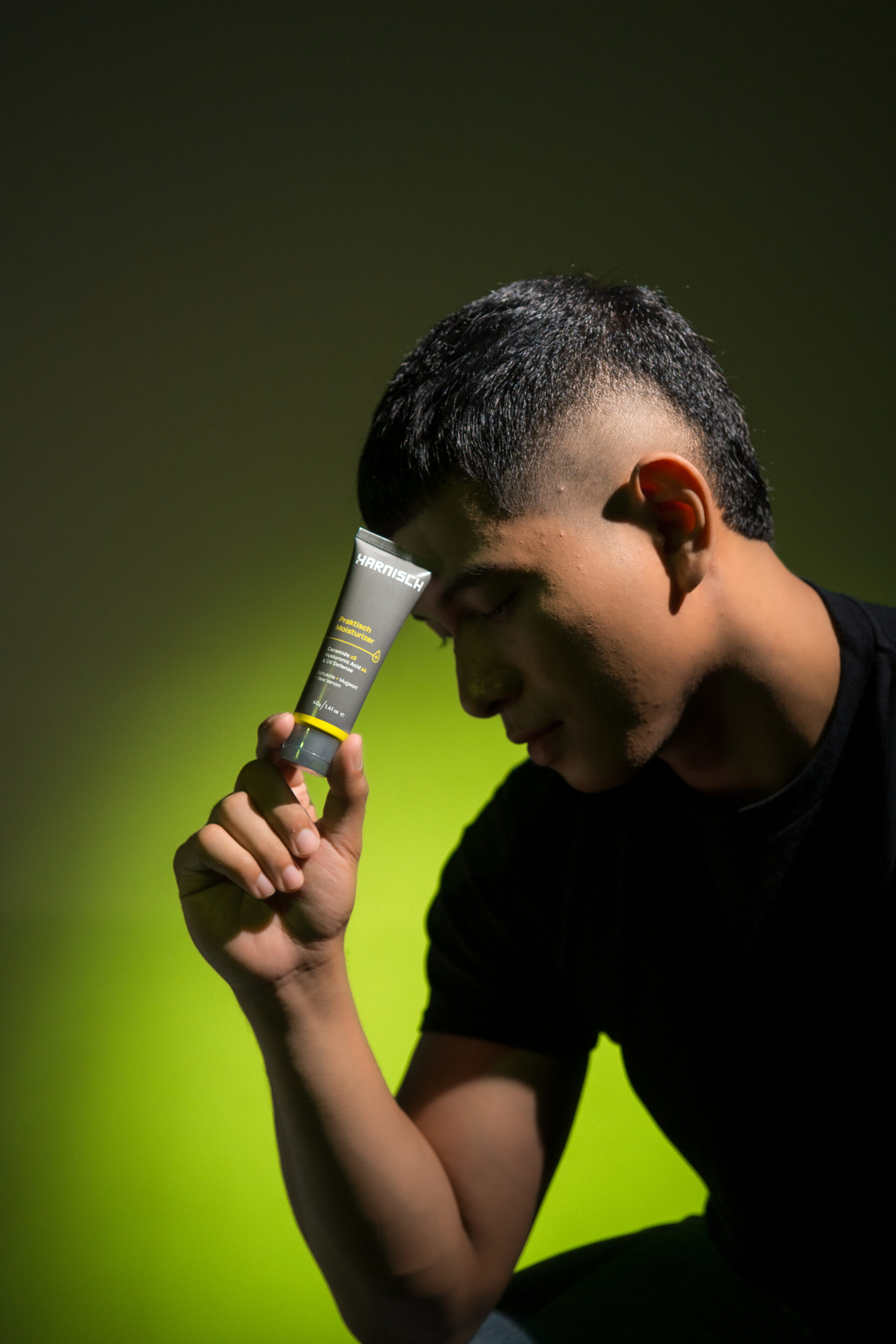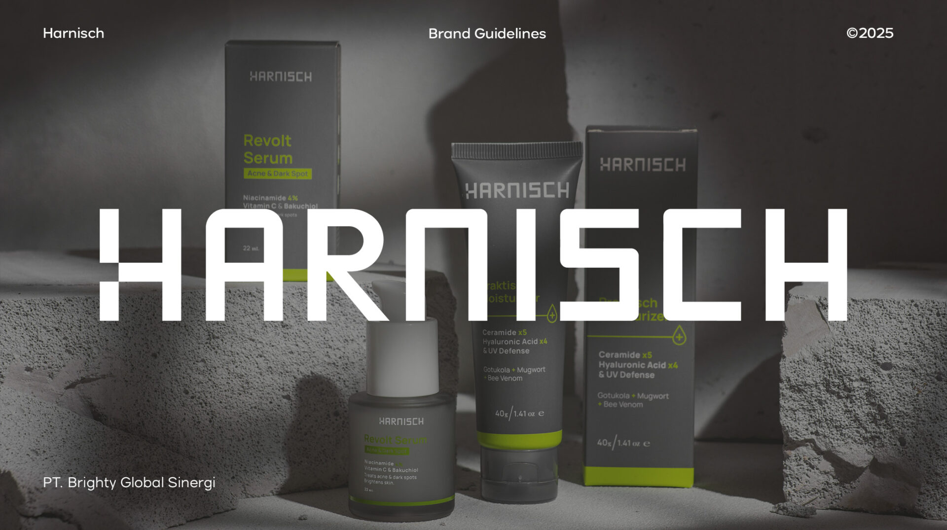
Strength in Simplicity: A Bold Balance of Masculinity
As a creative director, I see branding as more than just colors and design—it’s about storytelling, identity, and the feeling a product evokes. For this project, masculinity is the foundation, expressed through a palette of gray, black, and lime green. Gray and black embody strength, confidence, and timeless sophistication, stripping away excess to reveal pure, understated elegance. But true power isn’t just about depth—it’s about balance. That’s where lime green comes in. It’s the energy, the vibrance, the unexpected spark that breathes life into the bold foundation. This color choice is more than aesthetic; it speaks to the essence of masculinity today—resilient yet adaptable, strong yet refreshing. Beyond the visuals, natural ingredients tie everything together, ensuring that every product is not just designed to look good but to enhance and support well-being. This fusion of color, nature, and identity creates a brand that doesn’t just exist—it resonates, leaving an impact that’s both powerful and lasting.